

Best Practices for Creating High-Converting Graphics for Social Media
Creating graphics that actually convert on social media is no longer about aesthetics alone. High-performing visuals sit at the intersection of psychology, platform mechanics, brand consistency, and data-driven experimentation. Our guide breaks down proven best practices used by growth teams, performance marketers, and design leaders to consistently drive clicks, engagement, and conversions across social platforms.
Table of Contents
- Why High-Converting Social Media Graphics Matter
- Designing for Platform-Specific Behavior
- Visual Psychology That Drives Action
- Brand Consistency Without Creative Fatigue
- The Role of Copy, CTAs, and Hierarchy
- Formats, Dimensions, and Technical Optimization
- A/B Testing and Performance Optimization
- Tools and Workflows Used by High-Performing Teams
- Common Mistakes That Kill Conversions
- Future Trends in Social Media Graphic Design
- Top 5 Frequently Asked Questions
- Final Thoughts
- Resources
Why High-Converting Social Media Graphics Matter
Social media is a visual-first attention economy. Users scroll fast, decide faster, and rarely read captions unless the visual earns that attention. Research from Meta shows that users process images up to 60,000 times faster than text, making visuals the primary decision trigger for engagement. High-converting graphics do three things simultaneously. They stop the scroll, communicate value instantly, and guide the user toward a clear next action. Brands that master this consistently outperform competitors in engagement rate, click-through rate, and cost per acquisition.
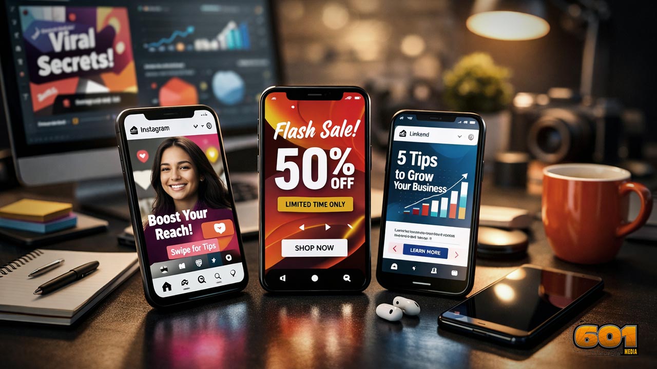
Designing for Platform-Specific Behavior
Each platform rewards different visual behaviors. Treating them the same is one of the fastest ways to underperform.
On Instagram, bold visuals, high contrast, and human faces dominate performance. Carousel posts consistently outperform single-image posts because they increase dwell time, a key ranking signal within Instagram’s feed algorithm.
TikTok prioritizes authenticity over polish. Graphics must feel native, fast, and mobile-first, often resembling user-generated content rather than traditional brand advertisements. Overproduced visuals frequently underperform because they break the platform’s informal visual language.
LinkedIn favors clarity and credibility. Clean layouts, clear data points, strong typography, and restrained color palettes outperform overly stylized or playful designs. Visuals that signal expertise and trust drive higher engagement and click-through rates.
Facebook still rewards emotionally driven visuals, particularly those that spark comments and shares. Graphics that evoke curiosity, empathy, or relatability tend to generate stronger organic reach through engagement-based distribution.
Understanding platform mechanics is not optional. High-converting graphics are designed for where they live, not where they were created.
Visual Psychology That Drives Action
Conversion-driven design is applied behavioral science. Contrast directs attention. The human eye is naturally drawn to the highest contrast area first. Your value proposition or call-to-action should always live there. Faces trigger emotional processing. Eye-tracking studies show that images with faces increase engagement, especially when the subject’s gaze leads toward the CTA. Color impacts perception. Blue builds trust, red creates urgency, green signals ease and growth. The key is consistency and intentional use, not trends. Simplicity wins. Cognitive load kills conversions. High-performing graphics communicate one idea per visual. If it needs explaining, it is already losing.
Brand Consistency Without Creative Fatigue
Strong brands convert better because familiarity reduces friction. However, repetition without variation leads to creative fatigue. High-performing teams build modular design systems. These include reusable layouts, typography scales, and color rules that allow rapid iteration without sacrificing brand identity. Consistency should live in structure, not sameness. Layout logic, font hierarchy, and visual rhythm matter more than using the same background repeatedly.
The Role of Copy, CTAs, and Hierarchy
Graphics do not replace copy. They amplify it. The headline must communicate the primary benefit, not the feature. “Save 10 Hours a Week” outperforms “New Productivity Tool” because it speaks to outcome, not function. CTAs should be visually dominant but minimal in wording. “Get the Guide,” “Watch the Demo,” and “Start Free” outperform vague prompts like “Learn More.” Hierarchy matters. The eye should flow from headline, to supporting visual, to CTA without confusion.
Formats, Dimensions, and Technical Optimization
Technical execution directly impacts reach and performance. Use native aspect ratios. Square and vertical formats consistently outperform landscape on mobile-first platforms. Optimize file size without degrading quality. Slow-loading visuals reduce engagement and algorithmic reach. Design for sound-off consumption. Graphics must communicate value without relying on audio or captions. Accessibility matters. High contrast text and readable font sizes improve performance and inclusivity.
A/B Testing and Performance Optimization
High-converting graphics are built, tested, and refined. Test one variable at a time. Headline, color, imagery, or CTA placement should be isolated to understand impact. Use platform-native analytics to track saves, shares, and click-through rates, not just likes. Winning designs become new baselines, not final answers. Continuous iteration is the competitive advantage.
Tools and Workflows Used by High-Performing Teams
Speed matters in social media. Design teams often rely on Canva for rapid iteration and template scalability, enabling marketers to produce on-brand graphics quickly without heavy design overhead. Its shared templates and real-time collaboration features are especially effective for fast-moving campaigns. More advanced teams turn to Adobe Photoshop for deeper creative control, complex compositing, and precision-level customization that supports high-impact brand storytelling. Across both approaches, version control, shared asset libraries, and clearly documented design rules reduce operational friction, maintain consistency, and significantly increase output quality at scale.
Common Mistakes That Kill Conversions
- Overloading visuals with text
- Ignoring platform culture
- Weak or missing CTAs
- Inconsistent branding
- Designing for aesthetics instead of action
Avoiding these mistakes often delivers faster gains than chasing new trends.
Future Trends in Social Media Graphic Design
AI-assisted design will accelerate production but not replace strategy. Personalized visuals driven by audience segmentation will outperform generic creatives. Motion-first graphics and lightweight animation will continue to dominate as platforms prioritize video engagement signals.
Top 5 Frequently Asked Questions
Final Thoughts
High-converting social media graphics are not accidents. They are the result of intentional design decisions grounded in psychology, platform intelligence, and continuous testing. The most successful brands treat visuals as strategic assets, not decorative elements. When design serves clarity, consistency, and action, conversion becomes a natural outcome.
Resources
Meta Business Insights
Nielsen Norman Group Visual Perception Research
HubSpot Social Media Benchmark Reports
Adobe Digital Trends Reports


Leave A Comment