


Data has become a key determinant of business success. With the right data, businesses can understand their customers, optimize their operations, and make strategic decisions. However, data is only useful if it can be understood and acted upon. That’s where Google Data Studio comes in. This free tool from Google allows businesses to visualize their data in interactive dashboards, making it easy to understand and interpret.
In our comprehensive guide, you’ll learn how to use Google Data Studio to create custom dashboards for your business. Whether you’re looking to analyze web traffic, sales data, or any other type of data, this guide will give you the skills you need to turn raw data into valuable insights.
You’ll learn everything from the basics of Google Data Studio, to advanced techniques for creating complex visualizations. Along the way, we’ll provide practical examples and step-by-step instructions to help you apply these techniques to your own data. By the end of this guide, you’ll be able to create custom dashboards that empower your business to make data-driven decisions.
Create Interactive Business Reports using Google Data Studio
Table of Contents
- What is Google Data Studio?
- Setting Up Google Data Studio
- Creating Your First Dashboard
- Adding Data Sources
- Creating Custom Visualizations
- Advanced Techniques
- Sharing and Collaborating on Dashboards
- Frequently Asked Questions
- Final Thoughts
- Sources
What is Google Data Studio?
Google Data Studio is a part of Google’s suite of tools that allows businesses to analyze, visualize, and share their data. In essence, it turns your data into informative, easy to understand dashboards and reports that are easy to read, easy to share, and fully customizable.
Google Data Studio: An Overview
Google Data Studio serves as an interface to transform your data into appealing and insightful visuals. It pulls data from various sources, which can be Google-owned properties like Google Sheets, Google Analytics, Google Ads, and YouTube, or from external databases and social media platforms. These data sources can then be combined, filtered, and visualized in a multitude of ways.
Key Features of Google Data Studio
Google Data Studio offers a variety of features that make it a powerful tool for data visualization:
- Data Connectors: These are pre-built connections to a variety of data sources, allowing you to pull data from multiple places.
- Data Transformation: It allows users to manipulate data in ways like creating calculated fields, aggregating data, or categorizing data in different ways.
- Report and Dashboard Creation: Users can create custom reports and dashboards, complete with interactive elements.
- Sharing and Collaboration: Google Data Studio leverages the sharing capabilities seen in Google Docs and Google Sheets, enabling users to collaborate in real-time.
Benefits of Using Google Data Studio
There are several advantages to using Google Data Studio:
- Simplicity: It offers a user-friendly interface that is easy to navigate, even for beginners.
- Integration: It can easily connect with various Google and non-Google platforms, providing a comprehensive view of data.
- Customization: Users have complete control over how they want to present their data.
- Cost-effectiveness: Google Data Studio is free to use, which makes it a great tool for small to medium-sized businesses or anyone on a tight budget.
In summary, Google Data Studio is an accessible, versatile, and powerful tool for any business looking to harness the power of data.
Setting Up Google Data Studio

Before you start creating reports and dashboards, you first need to set up your Google Data Studio account and get familiar with the interface. This section will guide you through the steps to set up your account, navigate through the Google Data Studio interface, and understand the basic features of the platform.
Creating a Google Data Studio Account
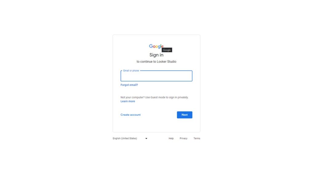
You don’t need to create a separate account for Google Data Studio if you already have a Google account. You can simply visit the Google Data Studio website and sign in with your Google account. If you don’t have a Google account, you’ll need to create one first.
Navigating the Google Data Studio Interface
Once you’re logged in, you’ll be taken to the Google Data Studio Home page. This page contains a variety of pre-made report templates and the option to create a blank report. The left-hand sidebar provides access to several options including ‘Reports’, ‘Data Sources’, and ‘Explorations’.
- ‘Reports’ is where you’ll find all your saved reports.
- ‘Data Sources’ is where you can connect to the various data sources available.
- ‘Explorations’ is a space to analyze your data without creating a full report.
On the right-hand side of the interface, you’ll find the ‘Theme and Layout’ panel. This panel lets you control the aesthetics of your reports, from the background color to the font style.
Understanding the Basic Features of Google Data Studio
Google Data Studio provides numerous features to help you create, customize, and share your reports:
- Data Connectors: This feature allows you to connect to a variety of data sources, both from Google (like Google Sheets, Google Ads, and Google Analytics) and non-Google sources (like SQL databases).
- Report Editor: This is the canvas where you create and design your reports. You can add charts, tables, and other data visualizations, as well as static elements like images and shapes.
- Sharing & Collaboration: Similar to other Google tools, Google Data Studio lets you share your reports with others and collaborate in real-time.
Understanding these basic features will give you a good starting point for creating your first report. In the following sections, we’ll delve into more detail about how to use these features effectively.
Creating Your First Dashboard
Creating your first dashboard in Google Data Studio can feel like a daunting task, especially if you’re new to data visualization. This section will walk you through the steps to create a simple, yet insightful dashboard.
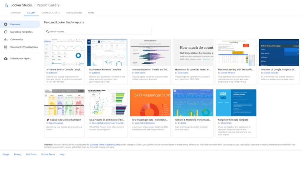
Choosing a Template
Google Data Studio offers a variety of pre-made templates that can help you get started quickly. These templates are designed for different use cases, such as website analytics, ad campaign tracking, or sales reporting. You can select a template that best suits your needs and modify it as needed.
Connecting to Data Source
Once you’ve selected a template, the next step is to connect it to your data source. In the report editor, you can select ‘Add Data’ to connect to a variety of data sources, like Google Sheets, Google Analytics, or a SQL database. Once connected, the fields from your data source will be available for use in your dashboard.
Designing the Layout
With your data connected, you can start designing the layout of your dashboard. You can add new pages, arrange elements on the page, and customize the appearance of your dashboard using the toolbar at the top of the report editor.
Adding and Customizing Charts
Next, you can start adding charts to your dashboard. Google Data Studio provides a variety of chart types, including bar charts, line charts, pie charts, and tables. You can add a chart by selecting the chart type from the toolbar, then clicking and dragging on the canvas to place and size the chart. Each chart can be customized with different colors, fonts, and other formatting options.
Adding Interactivity
Interactivity can make your dashboard more engaging and easier to navigate. You can add interactive elements like date range controls or filter controls that allow users to customize the view of the data. These controls can be added from the toolbar in the same way as charts.
Saving and Viewing the Dashboard
Once you’re happy with your dashboard, you can save it by selecting ‘File’ > ‘Save’. You can then view your dashboard by selecting ‘View’ at the top of the report editor. This will open your dashboard in a new tab, where you can interact with it as a user would.
Creating your first dashboard may take some time and experimentation, but with practice, you’ll be able to create insightful dashboards that help drive data-driven decisions.
Adding Data Sources
In Google Data Studio, a data source is the connection between the raw data you want to analyze and the visual representation of that data in your reports. In this section, we will guide you through how to add data sources to your Google Data Studio and how to manipulate and blend data from different sources.
Understanding Data Sources
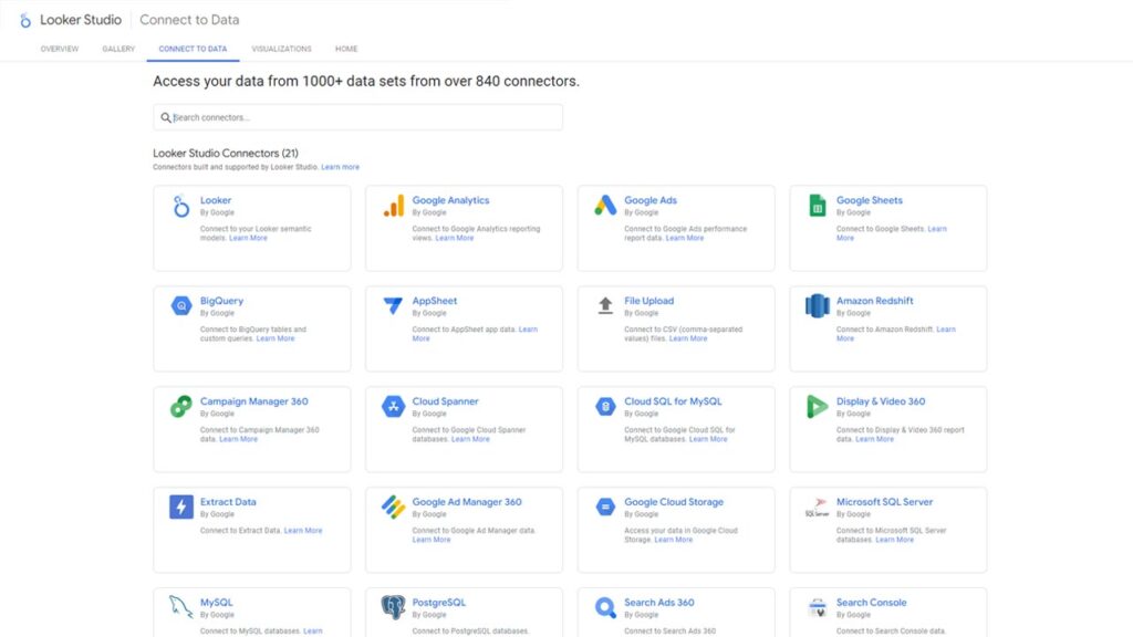
A data source in Google Data Studio is essentially a pipeline between your raw data and your reports. This data can come from a wide range of Google and non-Google platforms, including Google Analytics, Google Ads, Google Sheets, BigQuery, SQL databases, and more. Each data source provides a set of fields that you can use in your report, such as metrics and dimensions.
Connecting to Data Sources
To add a data source to your Google Data Studio:
- Open your report in Google Data Studio.
- In the toolbar at the top, click on
Add data. - You will see a list of available connectors. These connectors represent the different data sources you can connect to, such as Google Analytics or Google Sheets.
- Click on the connector for your data source. You may need to authorize Google Data Studio to access your data.
- Once connected, you will see a list of fields available from your data source. You can add, remove, or edit fields as needed.
Manipulating Data from Sources
After connecting a data source, you may need to manipulate the data to fit your needs. This can include creating calculated fields, changing data types, or aggregating data. To manipulate data:
- Open your data source in Google Data Studio.
- On the ‘Fields’ tab, you will see a list of all the fields from your data source. You can add, remove, or edit fields from this tab.
- To add a calculated field, click on
Add field. You can then define the formula for your calculated field using the available functions and operators. - To change a data type, click on the field you want to edit, then select the new data type from the dropdown menu.
Blending Data from Multiple Sources
Google Data Studio also allows you to blend data from multiple sources. This can be useful when you need to analyze data from different platforms in one report. To blend data:
- In your report, add a chart that supports data blending, such as a bar chart or a table.
- In the data tab of the chart’s properties panel, click on
Blend data. - Click
Add datato add the data sources you want to blend. Each data source will become a new ‘Join key’ that you can use to join the data. - Define the join keys and metrics for your blended data. The join keys should be fields that are common to all data sources.
By mastering the process of adding, manipulating, and blending data sources, you can create more complex and insightful reports in Google Data Studio.
Creating Custom Visualizations
One of the most powerful features of Google Data Studio is the ability to create custom visualizations. This process allows you to translate your raw data into meaningful, easy-to-understand visuals. This section provides a detailed guide on how to create custom visualizations in Google Data Studio.
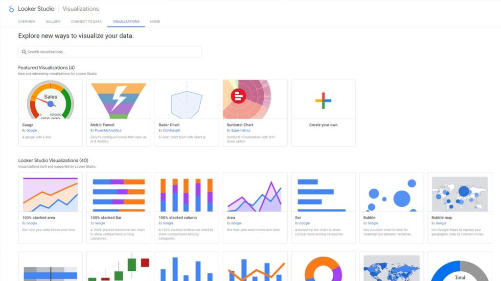
Understanding the Types of Visualizations
Google Data Studio offers a variety of visualization options to help you better understand your data. These include:
- Tables: Display your data in a simple, structured format.
- Bar and Column Charts: Compare different categories of data.
- Line Charts: Show trends and patterns over time.
- Pie Charts: Represent proportions or percentages.
- Scatter Plots: Visualize the relationship between two variables.
- Geo Maps: Display geographic variations in data.
Adding and Customizing Charts
To add and customize charts in Google Data Studio:
- Select a chart type from the toolbar at the top of the report editor.
- Click and drag on the canvas to place and size the chart.
- With the chart selected, use the properties panel on the right to customize the chart. Here, you can specify the data source, select the dimensions and metrics, and customize the appearance of the chart.
Creating Calculated Fields
Calculated fields allow you to create new data from your existing data. For instance, you can calculate the average of a set of numbers, combine text fields, or create a new date field.
To create a calculated field:
- In your data source, go to the ‘Fields’ tab.
- Click ‘Add Field’.
- In the formula editor, enter the formula for your calculated field. You can use a variety of functions and operators in your formula.
Using Conditional Formatting
Conditional formatting allows you to change the formatting of your data based on certain conditions. For example, you can change the color of a bar in a bar chart if its value is above a certain threshold.
To use conditional formatting:
- Select the chart you want to format.
- In the properties panel, go to the ‘Style’ tab.
- Under ‘Conditional formatting’, click ‘Add’.
- Define the condition and the formatting changes that should be applied when the condition is met.
Creating Geo Maps
Geo maps are a great way to visualize geographic data. To create a geo map:
- In the report editor, select the Geo Map option from the toolbar.
- Click and drag on the canvas to place and size the map.
- With the map selected, use the properties panel on the right to specify the data source, select the geographic field, and choose the metric to display.
By exploring these features, you can create custom visualizations that provide clear and meaningful insights into your data.
Advanced Techniques
While Google Data Studio is user-friendly and intuitive, harnessing its full potential requires understanding and using some advanced techniques. This section will delve into advanced concepts such as embedding external content, utilizing community visualizations, automating data refresh and scheduling report delivery.
Embedding External Content
Google Data Studio allows you to embed external content such as web pages and YouTube videos directly into your reports. This can be particularly useful if you want to include supplementary materials that enhance your data storytelling.
To embed external content:
- Select the URL Embed option from the toolbar in the report editor.
- Click and drag on the canvas to place and size the embed frame.
- With the frame selected, go to the properties panel on the right and paste your URL into the “URL” field.
Utilizing Community Visualizations
Community visualizations are custom visualizations created by members of the Google Data Studio user community. These visualizations allow you to represent your data in ways that are not possible with the built-in chart types.
To utilize community visualizations:
- In the report editor, select the Community Visualization option from the toolbar.
- Click and drag on the canvas to place and size the visualization.
- With the visualization selected, go to the properties panel on the right and click “Explore more” to open the Community Visualization Gallery.
Automating Data Refresh
Automating data refresh is a crucial feature that allows your reports to stay up-to-date with your data source. You can set different data connectors to refresh at different intervals, ranging from every few minutes to every month.
To automate data refresh:
- Open your data source settings.
- Under “Data freshness”, select the desired refresh interval from the dropdown menu.
Scheduling Report Delivery
Scheduling report delivery can be a time-saving feature that automatically sends updated reports to stakeholders on a regular schedule.
To schedule report delivery:
- Open your report and click on the “Schedule email delivery” button on the top bar.
- In the dialog that opens, specify the recipients, frequency, time, and optional message for the email.
By leveraging these advanced techniques, you can elevate the utility and efficiency of your dashboards, turning them into powerful tools for business intelligence.
Sharing and Collaborating on Dashboards

Google Data Studio offers robust features that allow you to share your dashboards and collaborate with team members. Whether you want to share your report with a select few or publish it for all to see, this platform has got you covered. This section will guide you through sharing options, permissions, and real-time collaboration in Google Data Studio.
Sharing Dashboards
Sharing your dashboards in Google Data Studio is a straightforward process. Here’s how to do it:
- Open your dashboard in the report editor.
- Click the “Share” button at the top right corner.
- Enter the email addresses of the people you want to share with, add a note if you want, and click “Send”.
Alternatively, you can click on “Get shareable link” to generate a link that you can share with others.
Managing Permissions
When you share a dashboard in Google Data Studio, you can control what others can do with it by setting permissions. Here are the permission levels you can set:
- Can view: The user can view the report, but can’t edit, share, or download it.
- Can edit: The user can view and edit the report, and share it with others. They can’t change access permissions or delete the report.
To manage permissions:
- Click the “Share” button in the report editor.
- Click on “Manage access”.
- Next to the person’s name or the shareable link, click the dropdown menu to set their permission level.
Real-time Collaboration
Google Data Studio allows multiple people to edit a report simultaneously. This can make collaboration more efficient, as team members can see changes in real-time and work together on the same dashboard. All you need to do is share the report with others with “Can edit” access, and they can join you in the report editor.
Publishing Reports

If you want your dashboard to be publicly accessible, you can publish it. Publishing allows anyone with the link to view your report, even if they don’t have a Google account. To publish a report:
- Click the “Share” button in the report editor.
- Click on “Manage access”.
- Turn on “Link sharing”. This makes your report accessible to anyone with the link.
Keep in mind that anyone with the link can view your report, so only publish reports that don’t contain sensitive data.
By mastering sharing and collaboration in Google Data Studio, you can make the process of creating, editing, and analyzing dashboards a team effort.
Frequently Asked Questions
Final Thoughts
In our current modern business world, the ability to leverage data is crucial. Google Data Studio provides a versatile and powerful tool for visualizing and interpreting data, enabling businesses to make informed decisions. The key takeaway from this guide is that, with a little time and practice, anyone can learn to use Google Data Studio to create custom dashboards that provide valuable insights into their business.


Leave A Comment