

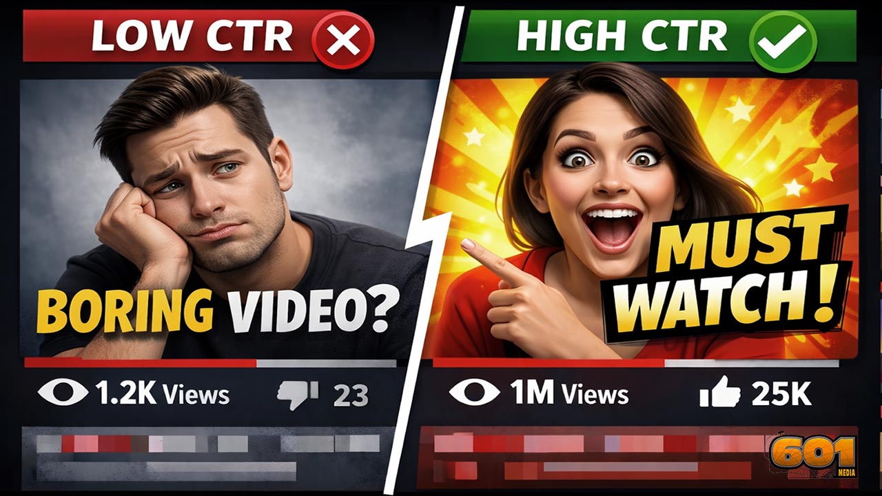
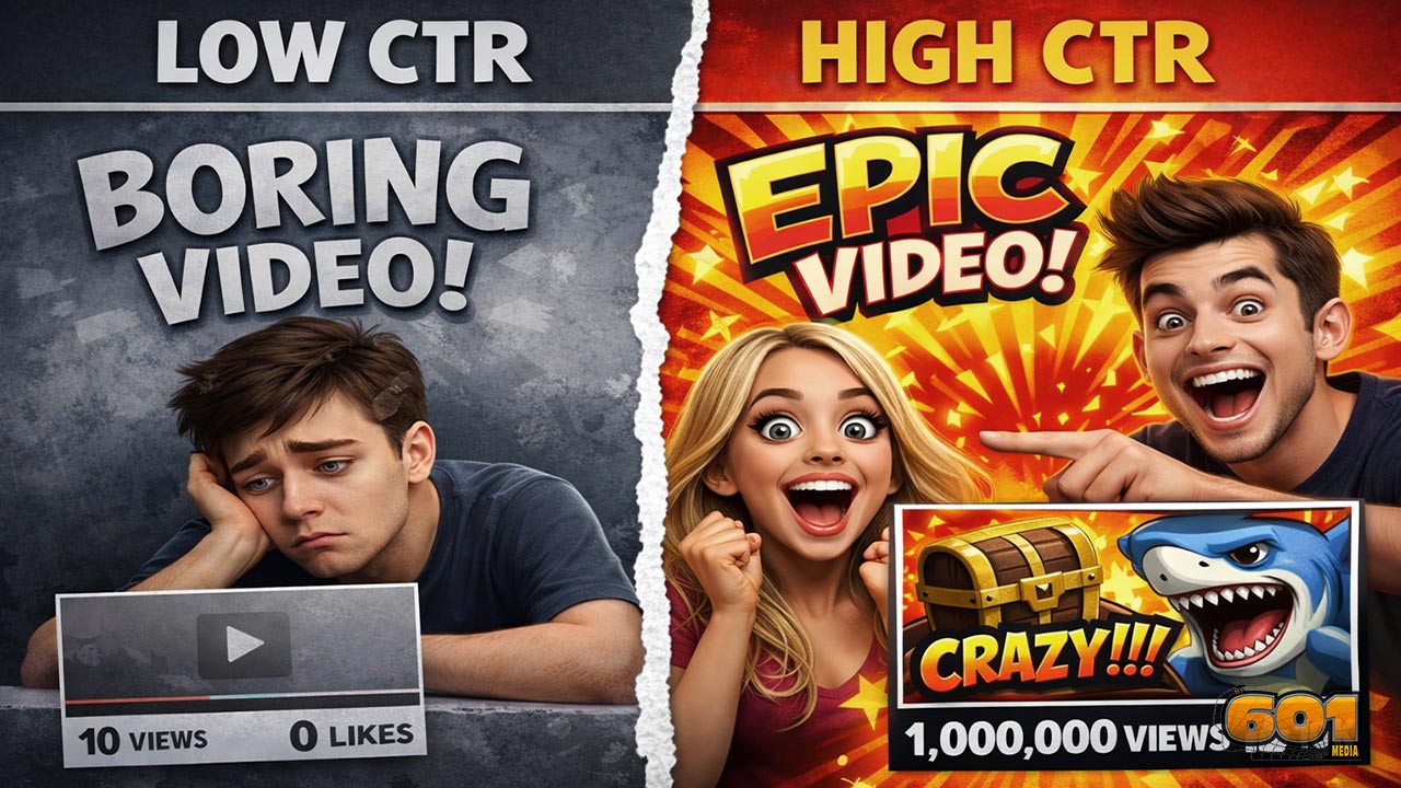
Video Thumbnails That Actually Drive Clicks: Psychology + Design Tips
- Thumbnails are not decoration; they are decision triggers.
- High-CTR thumbnails work because they reduce mental effort while increasing curiosity and perceived payoff.
- This guide breaks down the psychology of clicking and turns it into practical, repeatable design rules you can apply to YouTube-style feeds.
Table of Contents
- Attention economics: why thumbnails matter more than ever
- The psychology behind clicking a thumbnail
- Designing for ultra-fast visual processing
- Faces, emotion, and social attention
- Color, contrast, and pattern interruption
- Text on thumbnails: fewer words, stronger punch
- Branding without killing curiosity
- Mobile-first thumbnail design
- Testing and optimization that actually improves CTR
- Common mistakes that kill CTR (and how to fix them)
- Top 5 Frequently Asked Questions
- Final Thoughts
- Resources
Attention economics: why thumbnails matter more than ever
- In a YouTube-style homepage context, viewers rarely “browse” the way they browse a store aisle; they scan, compare, and decide fast.
- Your thumbnail is competing against dozens of other thumbnails, not just against “doing nothing.”
- That means thumbnail performance is less about artistic taste and more about decision ergonomics: how quickly the viewer can understand the promise and feel compelled to act.
CTR, watch time, and distribution momentum
- Click-through rate (CTR) is the percentage of impressions that turn into views. It is not a vanity metric; it is a signal that affects how much your video is shown, especially early on.
- Platforms do not reward clicks alone. They reward satisfied clicks. If your thumbnail spikes CTR but the video can’t retain viewers, recommendations tend to cool off.
- YouTube explicitly warns against clickbait titles and thumbnails because clickbait often causes low average view duration, reducing the likelihood of being recommended. Use this as a strategic constraint: increase curiosity while keeping the promise truthful. (See YouTube’s Impressions & CTR guidance in the Resources section.)
Where CTR matters most: Home and Suggested
- YouTube’s own guidance encourages creators to evaluate CTR specifically on discovery surfaces such as Home and Suggested, particularly in the first 24 hours after publication, because that is where viewers often discover new videos and channels. (See YouTube’s thumbnail and title tips in Resources.)
- Operational takeaway for creators and teams: build thumbnails for discovery contexts first, not for your subscribers who will click you anyway.
The psychology behind clicking a thumbnail
- Click decisions are emotional first and analytical second.
- The fastest thumbnails win because they reduce thinking while increasing desire.
- You are not trying to “explain the video” in a thumbnail; you are trying to trigger an informed impulse to learn more.
Curiosity gaps that feel irresistible (without being misleading)
- A curiosity gap is a deliberate, ethical incompleteness: the viewer sees enough to care but not enough to feel done.
- Strong curiosity gap patterns:
- Before/after implied but not fully revealed
- A surprising outcome hinted (reaction + a clue)
- A mistake previewed (a “wrong” method shown next to the “right” method)
- An unexpected comparison (two objects, one highlighted as the winner)
- Weak curiosity gaps:
- Vague hype text with no specifics
- Shocking claims that the video cannot support
- Visual clutter that confuses rather than teases
Value clarity: the “what do I get?” question
- Every effective thumbnail answers the viewer’s silent question: what will I gain, avoid, or feel if I click?
- Three value categories that consistently translate well to thumbnails:
- Transformation: “from X to Y” outcomes (skills, body, business, workflow)
- Reduction: less time, less money, fewer steps, fewer mistakes
- Access: “what experts do,” “inside look,” “the hidden reason,” “the real metric”
- Innovation and technology management lens: your thumbnail is a product packaging layer. It must communicate the “job to be done” instantly. If the job is unclear, adoption (clicks) drops.
Loss aversion: why “avoid this” often outperforms “get this”
- People are frequently more motivated to avoid loss than to pursue gain.
- Ethical “loss” framing that works:
- “Stop doing this” paired with a clear example
- “This is why you’re stuck” paired with a recognizable symptom
- “Don’t buy until you know this” paired with one key decision criterion
- Unethical “loss” framing:
- Fearmongering with no actionable advice
- False urgency (“You must do this today” when it’s evergreen)
Designing for ultra-fast visual processing
- Many thumbnail failures are not creative failures; they are decoding failures.
- If the viewer must stop and interpret, you lose to a competitor whose thumbnail can be understood instantly.
Visual hierarchy and one clear focal point
- Pick one hero element:
- A face with a big, readable emotion
- A single object (product, tool, chart, “result”)
- One short word or number that carries the hook
- Everything else is support, not competition.
- Practical hierarchy rules:
- One dominant subject takes 50–70% of the visual weight
- One secondary element adds context (an arrow, a “before” item, a small label)
- One background layer provides contrast, not detail
Cognitive load: why simpler usually wins
- Eye-tracking research from Nielsen Norman Group shows that people commonly scan content rather than read it carefully, and scanning patterns are shaped by goals and time pressure. In a feed, the goal is quick selection. (See NN/g scanning research in Resources.)
- Thumbnail implication: reduce cognitive load by removing:
- Extra props that don’t change the story
- Text that repeats the title
- Busy backgrounds that hurt legibility
- Team tip: when stakeholders ask to “add more context,” try solving it with one clearer symbol or one better word instead of adding elements.
Faces, emotion, and social attention
- Faces work because humans are tuned to social signals.
- In creator-led content, a face often becomes the brand asset that scales across videos: viewers recognize you faster than they read.
- In brand content, faces still work, but the face must be relevant (expert, customer, presenter) rather than generic stock-feeling imagery.
Big, readable expressions that work on mobile
- Thumbnails are often seen small; subtle emotions disappear.
- High-performing expressions are “high signal”:
- Surprise: wide eyes, open mouth
- Concern: eyebrows up and in, tension in mouth
- Delight: big smile plus “look at this” energy
- Shock/confusion: head tilt, eyebrows lifted, mouth slightly open
- Use close crops. A face that is 10% of the thumbnail is rarely as effective as a face that is 30–50%.
Gaze direction and pointing cues
- Viewers follow implied direction:
- Eyes looking toward the key object
- Hands pointing toward the text hook
- Arrows used sparingly to highlight the “story object”
- Design heuristic: if the face is looking somewhere, make sure that “somewhere” is your hook, not empty space.
Color, contrast, and pattern interruption
- Contrast is not just aesthetic; it is readability and speed.
- Pattern interruption is how you avoid blending into the feed.
Contrast rules that improve legibility
- Foreground and background should separate cleanly:
- Bright subject on darker background or dark subject on bright background
- Text placed on a clean block or strong gradient rather than on noisy textures
- Outline and shadow are tools, not style:
- Use a stroke or shadow to preserve readability on diverse screens
- Avoid muddy shadows that reduce sharpness
- Use saturation strategically:
- High saturation draws attention but can look cheap if everything is saturated
- Better: one saturated hero element against a calmer backdrop
Winning the feed: differentiate, don’t decorate
- Do a quick competitor scan in your niche:
- What colors dominate?
- How many words are typical?
- Are most thumbnails dark, light, or mid-tone?
- Your goal: be “the obvious different one” while staying on-brand.
- Practical example:
- If your niche is mostly neon with heavy text, consider cleaner design with one bold word and one strong face.
- If your niche is mostly minimal, consider a brighter background and a stronger emotional expression.
Text on thumbnails: fewer words, stronger punch
- Thumbnail text is a hook, not a summary.
- Text should add a new layer that the title does not provide.
2–4 words, not a sentence
- Common high-performing text structures:
- Action: “DO THIS”
- Warning: “STOP THIS”
- Outcome: “IN 7 DAYS”
- Reveal: “THE REAL REASON”
- Comparison: “A VS B”
- Best practice: keep text short enough to read instantly at small size. If you need more than a few words, your concept likely isn’t clear enough.
Type system: fonts, strokes, and readability
- Use one consistent font family across your channel or series to build recognition.
- Bold sans-serif fonts tend to remain legible at small sizes.
- Use consistent treatments:
- Stroke thickness that survives compression
- Simple shapes behind text when the background is complex
- Avoid thin fonts, cursive styles, or too many font changes in one thumbnail.
Branding without killing curiosity
- Branding should frame the promise, not replace it.
- In innovation and technology management terms, your thumbnail is both marketing and product interface: recognition matters, but conversion matters more.
Template systems that scale
- A scalable thumbnail system includes:
- Fixed zones (face zone, text zone, context zone)
- A consistent color family (2–3 main colors plus accent)
- Reusable iconography (arrows, circles, simple badges)
- What changes video-to-video:
- The emotional expression
- The “story object” (tool, result, chart, comparison)
- The 2–4 word hook
Why over-branding depresses clicks
- Over-branding looks like an ad, and viewers treat it like one.
- Common over-branding patterns:
- Large logo dominating the frame
- Too much corporate header space
- Template that is identical every time, removing novelty
- Fix: keep brand cues subtle (a corner mark, a consistent color ribbon) and let curiosity dominate the composition.
Mobile-first thumbnail design
- Mobile-first is not a trend; it is the default reality for many audiences.
- Multiple industry summaries report that a majority of YouTube watch time comes from mobile devices (often cited around the low 60% range). See the mobile watch-time references in the Resources section. Treat the exact percentage as an estimate that varies by country, content type, and time period.
Why mobile dominance changes your layout
- Small screens punish:
- Small faces
- Thin type
- Complex scenes
- Low contrast
- Small screens reward:
- Close crops
- One dominant object
- Big emotional signal
- High-contrast text with minimal words
Mobile checklist: cropping, type, and spacing
- Design at full size, then preview at the smallest likely display size and test for:
- Text legibility within one glance
- Face readability (can you tell the emotion immediately?)
- Clear separation of foreground and background
- No tiny details required to “get it”
- Operational tip: keep a standardized “mobile preview” step in your workflow, especially if thumbnails are produced by different designers or agencies.
Testing and optimization that actually improves CTR
- Great channels do not “find” a perfect thumbnail style once; they run a thumbnail improvement system.
- Testing turns thumbnail decisions from opinion battles into performance learning.
A/B testing with YouTube Studio-style tools
- YouTube has rolled out testing functionality that allows creators with access to advanced features to test multiple titles, thumbnails, or combinations. This enables a more experimental approach to packaging. (See the YouTube Help thread and coverage in Resources.)
- Practical advice:
- Test one major difference at a time (face vs no face, different emotion, different hook word, different background contrast).
- Keep the video content constant so you are testing packaging, not substance.
What to measure: CTR with watch-time alignment
- CTR alone can be misleading if it is driven by a promise the video does not fulfill.
- Use a paired-metric mindset:
- CTR indicates packaging attraction.
- Average view duration and retention indicate satisfaction.
- YouTube’s own documentation notes that clickbait tends to produce low average view duration and therefore becomes less likely to get recommended. Use that as a guardrail when interpreting test results. (See YouTube’s impressions & CTR FAQs in Resources.)
Iteration playbook for teams and solo creators
- Step 1: Define the one-sentence promise of the video.
- Example: “You’ll learn 3 thumbnail design changes that reliably increase CTR without misleading viewers.”
- Step 2: Choose a single story object.
- Example: a split-screen “low CTR” vs “high CTR” layout, or a single bold metric improvement.
- Step 3: Select the primary emotion that matches the promise.
- Education + surprise, or warning + concern, or success + excitement.
- Step 4: Write three thumbnail hooks (2–4 words).
- Examples: “STOP THIS,” “CTR BOOST,” “THUMBNAIL FIX.”
- Step 5: Produce 3 variants that differ in only one key dimension.
- Variant A: same layout, different hook word
- Variant B: same hook, different facial expression
- Variant C: same concept, different contrast/background
- Step 6: Evaluate against the paired-metric mindset (CTR plus retention signals) and keep the winner.
- Step 7: Document what you learned in a “thumbnail pattern library” so knowledge compounds across your channel or organization.
Common mistakes that kill CTR (and how to fix them)
- Too much text
- Why it fails: slow decoding on mobile; looks like clutter.
- Fix: cut to 2–4 words; move detail into the title.
- Low contrast
- Why it fails: blends into the feed; text becomes unreadable.
- Fix: increase separation between subject and background; simplify the background behind text.
- No focal point
- Why it fails: the eye does not know where to land.
- Fix: one hero element; everything else supports it.
- Generic visuals
- Why it fails: looks like stock content; no unique story.
- Fix: add a specific story object (a result, a tool, a comparison) and a distinct emotional signal.
- Misaligned promise (clickbait)
- Why it fails: high CTR can lead to low view duration, reducing recommendations; also harms trust.
- Fix: keep curiosity, but ensure the video delivers the exact payoff implied by the thumbnail. (See YouTube’s guidance in Resources.)
- Designing in isolation
- Why it fails: a thumbnail can be “good” but not different enough to win the feed.
- Fix: design after scanning your niche’s current patterns; differentiate strategically.
Top 5 Frequently Asked Questions
Misleading clickbait can increase CTR but often harms average view duration and trust, which can reduce recommendations over time. YouTube explicitly cautions against clickbait because it tends to underperform on viewer satisfaction signals. Aim for curiosity that is truthful.
Faces frequently help for creator-led content because they deliver instant emotion and recognition. They are not mandatory for every niche, but if you use faces, crop tight and make the emotion readable at small sizes.
Typically 2–4 words. The more words you add, the more you slow down decoding, especially on mobile. If you need more text, your concept likely needs simplification.
Start with the biggest levers: (1) clearer focal point, (2) stronger contrast, (3) more legible emotion (if using a face), and (4) a tighter curiosity/value hook. Then run controlled tests where each variant changes only one major element.
Wait long enough to gather meaningful impressions data, especially from discovery surfaces like Home and Suggested, then update underperformers. YouTube’s guidance highlights evaluating CTR on key discovery surfaces early on; after that, treat thumbnails as updatable performance assets rather than permanent artwork.
Final Thoughts
- The most effective thumbnails are not “prettier.” They are faster to understand and harder to ignore.
- High-CTR thumbnails align psychology (curiosity, emotion, value clarity) with design execution (hierarchy, contrast, simplicity).
- If you manage thumbnails like an innovation system, not a one-off creative task, you get compounding returns:
- Each test teaches you what your audience responds to.
- Each winning pattern becomes reusable IP for future uploads.
- Each improvement increases the probability that the platform allocates you more impressions.
- The core takeaway: design thumbnails as behavioral interfaces. Optimize for instant comprehension, truthful curiosity, and mobile-first legibility, then validate with testing that considers both CTR and viewer satisfaction.
Resourses
- YouTube Help: Thumbnail & title tips
- YouTube Help: Impressions & click-through-rate FAQs
- YouTube Help Community: A/B test titles and thumbnails announcement
- The Verge: Coverage of YouTube title and thumbnail testing expansion
- Nielsen Norman Group: F-shaped pattern and scanning behavior
- Nielsen Norman Group: How people read online (scanning remains consistent)
- Nielsen Norman Group: How little users read (skimming context)
- Global Media Insight: YouTube usage statistics (includes mobile watch-time claim)
- The Social Shepherd: YouTube statistics (includes mobile watch-time claim)


Leave A Comment